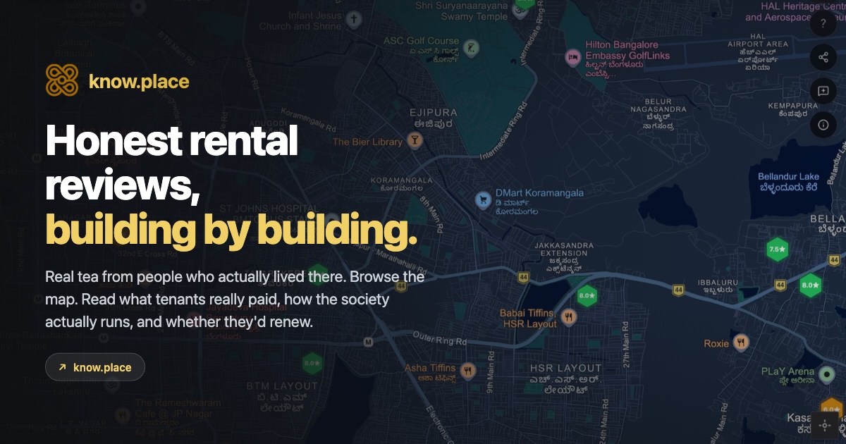
If you’ve read the introduction to know.place, you know what the product is and why it exists. This post is the hands-on tour. Open know.place in another tab and follow along; it’s faster to do than to read about. About ten minutes end-to-end.
Reviews on know.place are anonymous to the public (the tagline is “anonymous reviews, building by building”), so people tend to be honest about the bad parts. Everything below is browsable without an account.
Step 1. Open the map and take the welcome tour
Go to know.place. On your first visit a short welcome tour appears: a few illustrated cards (an introduction carousel plus a guided walk-through) that explain what the map shows and what each button and pill does.
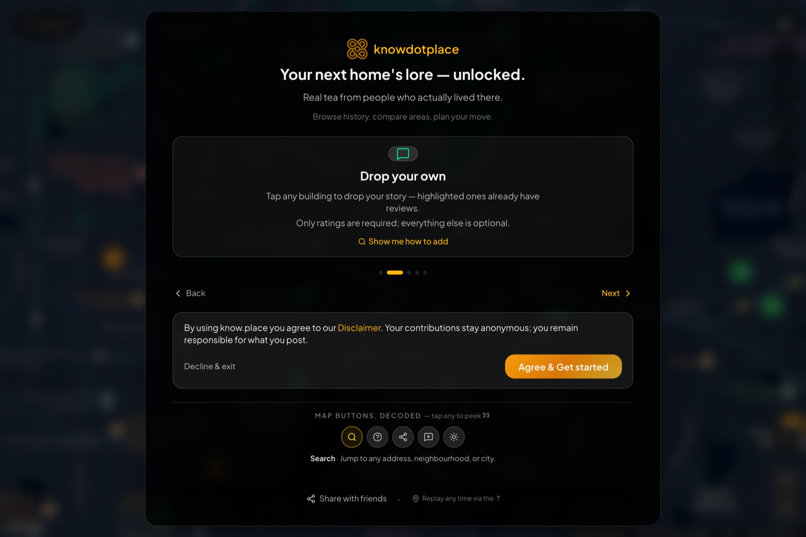
It’s worth clicking through once; there are only 4 or 5 cards and they orient you fast. The last card has a “Don’t show again” checkbox, so once you’ve seen it the tour stays out of your way on future visits. You can replay it any time from Settings → Help & feedback → Show the welcome tour, and the same tab has an Icon legend that explains every marker and pill on the map.
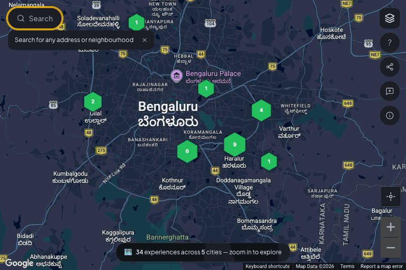
With the tour closed you land on a dark map of India, with a small pill at the bottom counting the live dataset: “N experiences across M cities, zoom in to explore”. That number climbs as people add reviews. Until you zoom in, the map stays quiet by design: building markers only appear at the zoom levels where they’re individually clickable, so a nationwide dot-storm never gets in your way.
Step 2. Find your area
You can either scroll-zoom the map into the area you’re considering, or use the search bar at the top-left. Search supports:
- Neighbourhoods: “Koramangala”, “Powai”, “Gachibowli”, “Salt Lake”.
- Full addresses: paste a Google Maps address you copied from a listing site and it’ll resolve.
- Landmarks: a popular metro station, a hospital, a college, a shopping mall.
- PIN codes: works as a rough area locator (the search will recentre on the centroid of the PIN code area).
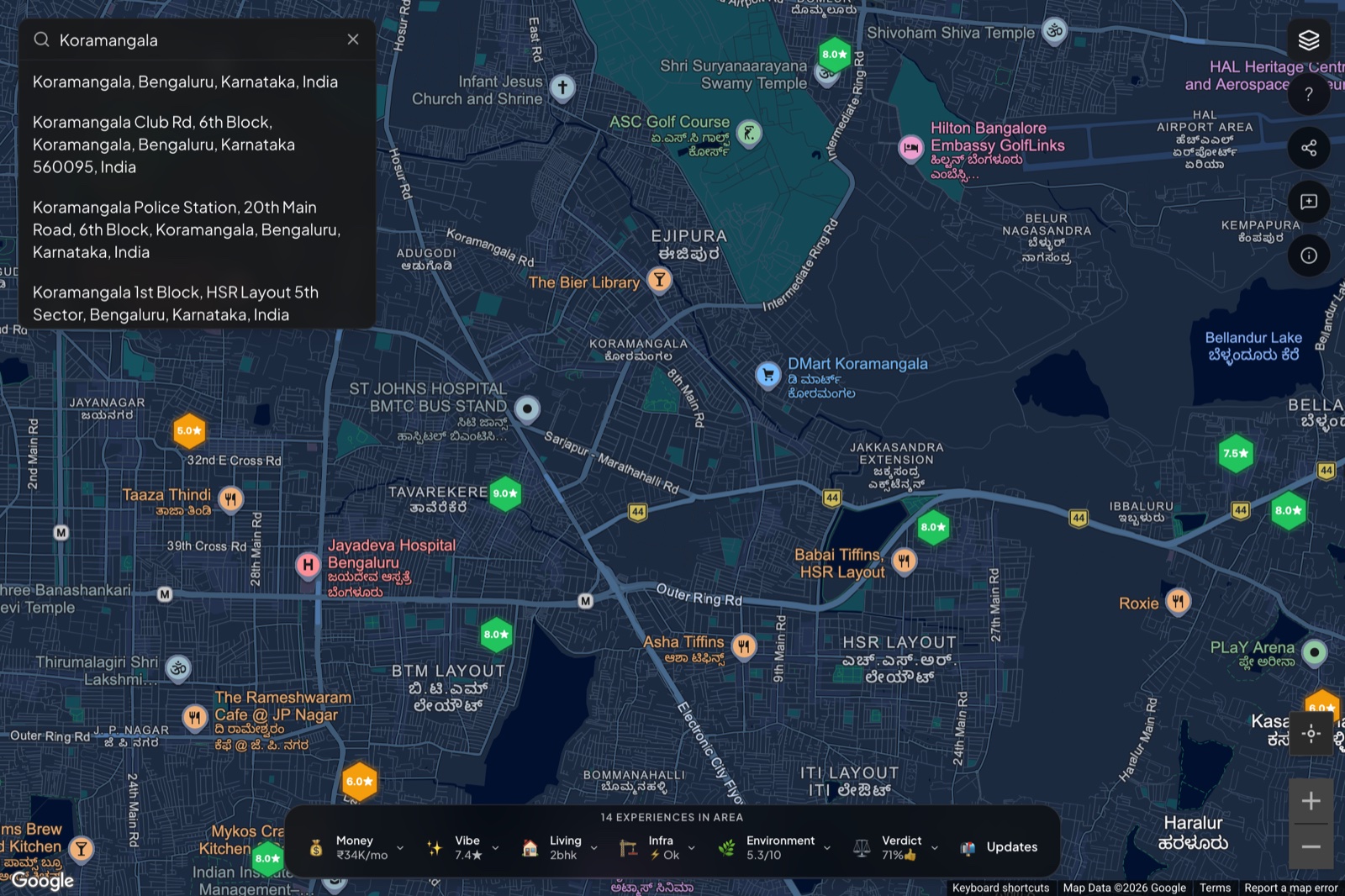
Pick a suggestion and the map flies to that location and zooms in to a level where the data is visible. You can pan and zoom from there normally. Here’s the flow in motion:
Tip. If the address you have is on a listing site and you don’t want to retype it, click the listing’s “Show on map” link, then copy the Google Maps URL from your browser address bar and paste that into the know.place search. The search box parses Google Maps URLs and jumps directly.
Tip. The URL in your browser address bar updates as you pan and zoom. If you want to bookmark a specific view, or send a friend “look at this area”, just copy that URL.
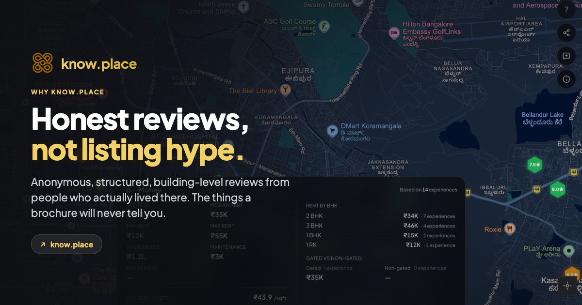
Step 3. Read the area dock
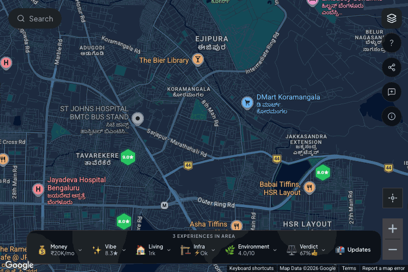
As soon as enough reviews are in the visible viewport, a horizontal dock anchors to the bottom of the screen:
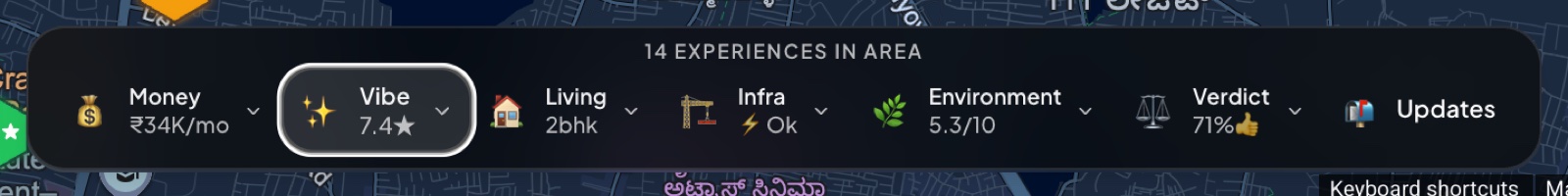
The header line tells you how many reviews this aggregation is built from. Below it sit six summary pills, plus an “Updates” tile. Each pill now carries a compact two-part subtitle so you get a fuller read without even clicking:
- Money: the median rent in the visible area (for example “₹38.5K/mo”).
- Vibe: the average rating, split into the flat score and the area score (for example “7.2★ flat · 7.1★ area”). When those two diverge it tells you whether people love the homes but not the locality, or the reverse.
- Living: the most common configuration (for example “Mostly 2bhk apartments”). A quick “is this an area of 1RKs or family-size 3BHKs?” read.
- Infra: power and water reality side by side (for example “⚡ Rare cuts · 💧 24×7”). The two things renters ask about first.
- Environment: noise and safety side by side (for example “🔊 Loud · 🛡️ Safe”).
- Verdict: the share of reviewers who would live in this area again (for example “👍 72% would live again”). This is the single most predictive number we have. Areas under 50% verdict are usually areas to avoid even if every other number looks fine.
Each pill is a hint, designed to be readable at a glance. The real richness is one click away.
Tip. The dock recomputes every time you pan or zoom. If you want to compare two micro-areas, pan to the first, note the verdict and money, then pan to the second and compare. You don’t need to reload the page or click anything.
Step 4. Drill into any pill
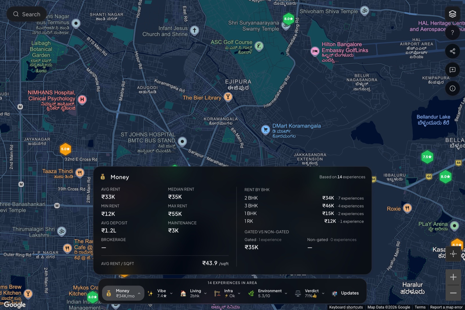
Click any of the pills and a detail panel pops open with the full breakdown for that dimension:
In motion, the panel slides in from the dock and a backdrop appears behind it so you can click outside (or press Escape) to dismiss:
Every panel follows the same shape:
- A small header with the dimension name and the count of underlying reviews.
- The headline number(s) front and centre.
- A breakdown by the most useful sub-dimension. For Money that’s BHK. For Living it’s gated-vs-independent. For Vibe it’s the high/mid/low histogram of area ratings. For Verdict it’s the would-rent / would-buy / would-recommend split.
- A “top traits” section that aggregates the most-mentioned pros and cons from free-text fields, ordered by frequency.
The Money panel is the densest. It shows average, median, minimum and maximum rent in the visible area; rent broken down by BHK; gated versus non-gated rent split; average deposit (and security deposit as months of rent, since the absolute number varies wildly by city); maintenance; brokerage; and rent per square foot. Rent per sqft is often the most useful single number for comparing across micro-areas because it normalises for unit size.
The Verdict panel breaks down would-rent-again, would-buy, would-recommend percentages, plus the top pros and cons that recur across reviews. This is the panel to look at if you’re deciding between two areas.
The Living panel shows the BHK distribution, furnishing distribution, and gated-vs-independent split. If you’re a couple looking for a 2BHK and the area is 80% 1BHK, that’s the panel that surfaces it.
The Vibe panel shows the distribution of ratings (high, mid, low) plus the flat-vs-area comparison. A big gap between flat and area ratings is a useful signal that the building experience is being undercut by the surrounding area, or vice versa.
Every panel carries a “Based on N experiences” badge so you can size up how confident the number actually is. Anything under 5 experiences is statistically noisy; treat it as a directional hint, not a verdict. Anything over 15 starts to be genuinely useful. We surface the count specifically so you can do this math yourself rather than relying on a confidence-coloured pill.
Press Escape, click outside the panel, or click the close button at the top right to close it.
Step 5. Set your workplace
For most renters in Indian metros, the single biggest day-to-day cost of a flat isn’t the rent, it’s the commute. So before you start opening buildings, it’s worth anchoring the map to where you actually work. Then every building you look at tells you, up front, how far it is from your office.
Click the briefcase icon on the right rail (or open Settings and go to Workplace). Search your office address, give it a name if you like, and save it.
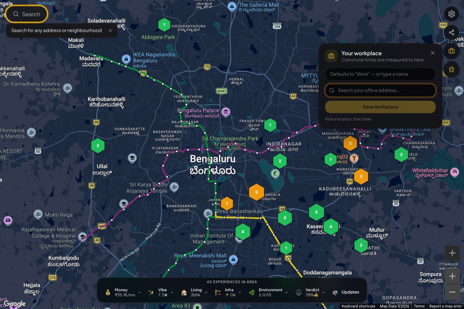
From then on, every building panel measures the commute to your workplace alongside a few auto-picked tech parks. It’s saved on your device, not tied to an account, so you don’t need to sign in to use it.
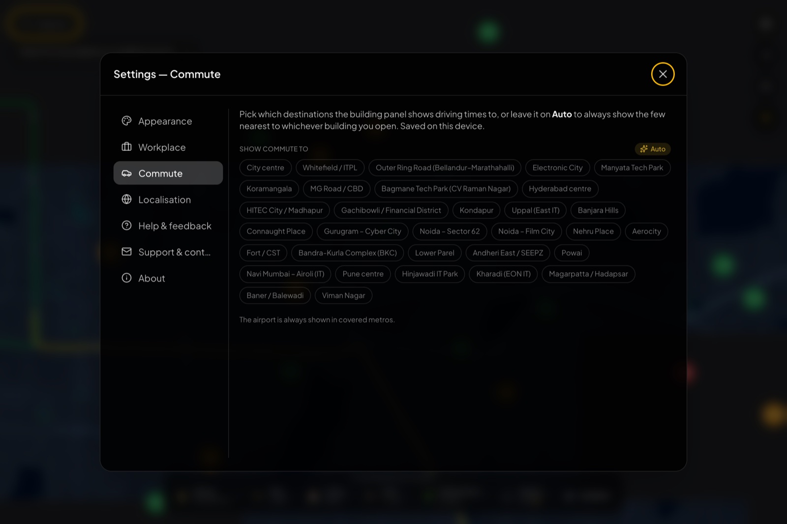
If you’d rather compare against specific business districts than your own office, open Settings → Commute. You get a long list of destination chips covering the major employment hubs across cities (Whitefield, ORR, Electronic City, Manyata, HITEC City, Gachibowli, Cyber City, BKC, Powai, Hinjawadi, and many more). Pin the ones you care about, or leave it on Auto to always show the few nearest to whichever building you open.
Step 6. Turn on metro lines
The right rail has a metro toggle. Switch it on and the city’s metro network is drawn over the map, colour-coded by line.
Combined with the per-building “nearest station” readout you’ll see in the next step, it’s a quick way to gauge how a shortlist of buildings sits relative to the network, before you commit to a place that turns out to be a 20-minute auto ride from the nearest station. Toggle it back off when the lines start to clutter the view. (Metro lines only appear in cities that have a metro.)
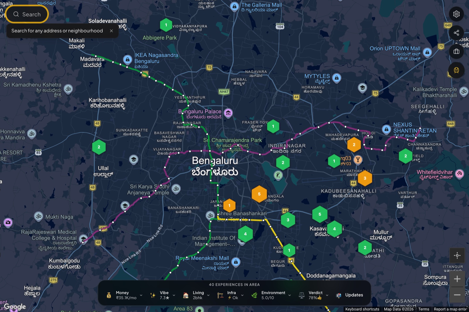
Step 7. Read a building
Now the core of the product. With your workplace set and metro lines on, click any building’s hexagon on the map.
The colour of the hexagon already gives you a hint. Green is high-rated, amber is the middle band, red is low. The number printed on the hexagon is the aggregate flat-rating out of 10 across all reviews of that building, so you don’t have to interpret colour alone.
Clicking opens a building panel on the right. At the top, the header shows the address and a one-line summary: how many experiences the building has and its average scores. Below that, the panel is a stack of sections, each one answering a question you’d otherwise have to research yourself.
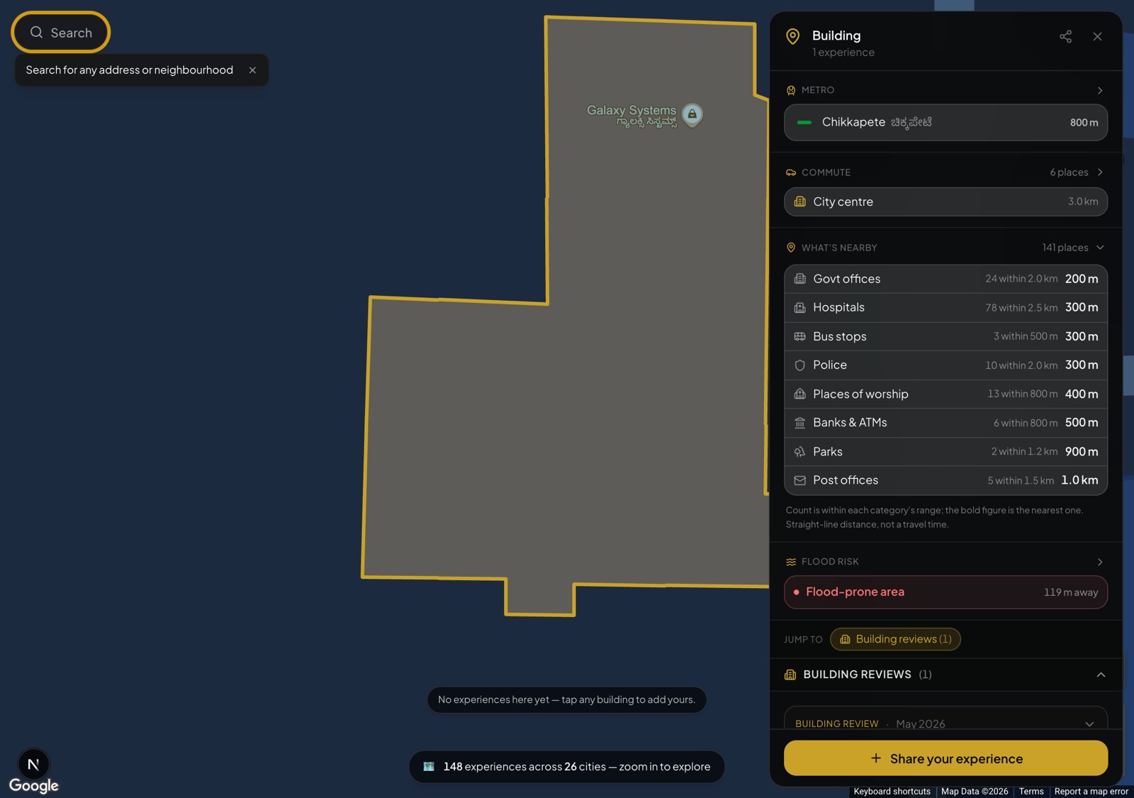
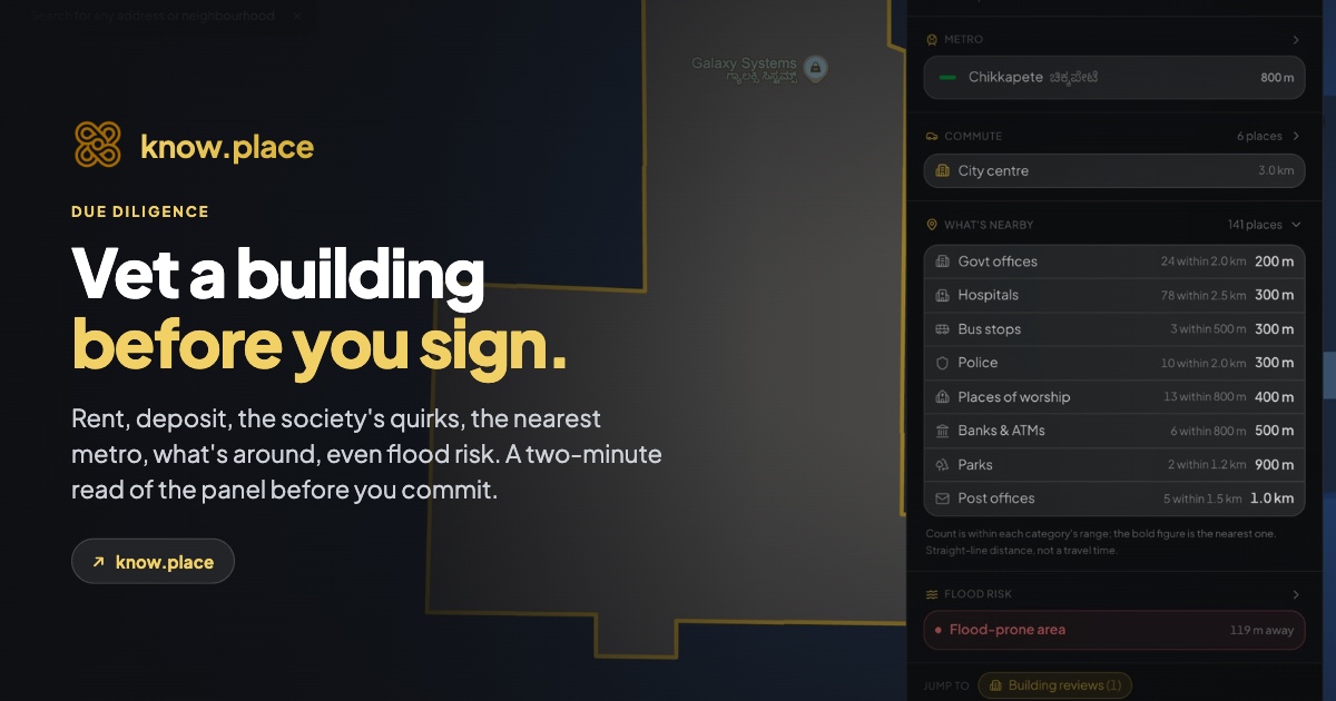
Metro
Where we have metro data, the first section is the nearest station, with its line colour, the station name (in English and the local script), and how far away it is (for example “Chikkapete · 800 m”). It’s there so you can sanity-check the “well-connected” and “walk to the metro” claims that every listing makes. The arrow on the header expands it to show more nearby stations.
Commute
Next is the commute panel, one of the most useful sections. For the building you’ve opened, it shows estimated driving times and rough fares to nearby destinations people actually commute to: tech parks, business districts, the city centre, and the airport. Because you set your workplace back in Step 5, your own office shows up here too, so you can read every building against your real commute. By default it shows the few nearest destinations, and a Customize link lets you pick exactly which places to show.
The fares and times are directional. They’re meant for comparing buildings against each other (“this one is closer to my office than that one”), not for planning a specific trip at a specific hour.
What’s nearby
Where we have the data, a “What’s nearby” section counts the everyday amenities around the building, by category, and tells you how close the nearest one is: hospitals, bus stops, police, banks and ATMs, parks, places of worship, government and post offices. Each row reads like “Hospitals · 78 within 2.5 km · 300 m”, so you can tell at a glance whether a building is in the thick of things or a quiet pocket. The counts are within each category’s range and the bold figure is the nearest one, measured as straight-line distance rather than travel time.
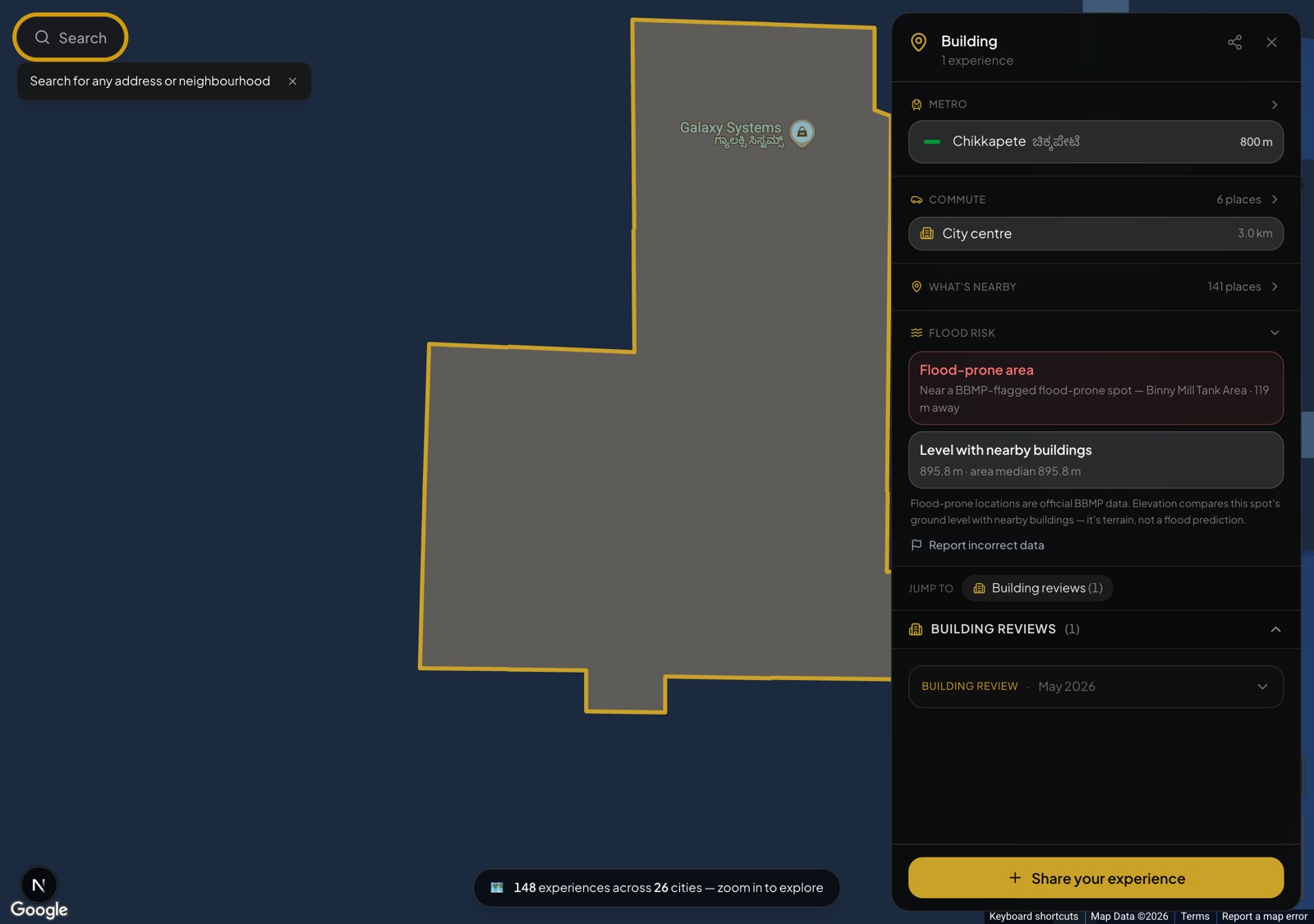
Flood risk
For areas where the data exists, a flood-risk section flags two separate things. First, whether the building sits near an officially flagged flood-prone spot, and how far away it is. Second, how the building’s ground level compares with nearby buildings, since a plot that sits low relative to its neighbours tends to take on water first. The proximity flag comes from official municipal (BBMP, in Bengaluru) data, and the elevation read is a terrain comparison, not a flood prediction. There’s a “Report incorrect data” link if something looks off.
Reviews
Below the context sections come the actual experiences. The panel shows whichever review types exist for that building, with a “Jump to” chip strip so you can skip straight to a section, plus a sort (most recent or all-time) and a rent-range filter:
- Flat reviews are what specific tenants thought about their unit: the rent they paid, the BHK and floor, whether it was furnished, water and power realities, would they renew, what they liked, what they hated.
- Neighbourhood reviews cover the area around the building: how the locality feels, safety, noise, what’s walkable, the things you only learn after living there a while. Each carries an area score out of 10 and the month it was written.
Individual review cards expand when you click them, so you can scan the headlines first and dig into the ones that look relevant. Each card has its own share button and a flag button to report something that looks fake or abusive.
If the building you clicked has a 3D scan or panoramic tour attached, you’ll see a “View tour” button in the header. Tours are still rolling out, so most buildings don’t have one yet.
Tip. Reviews are dated, and recent ones carry more weight: a building’s management, parking norms, and neighbour profile can shift meaningfully over a year or two. A glowing review from three years ago doesn’t guarantee the building is still glowing.
Tip. If the building has only one or two reviews, take them seriously but read them with the area dock for context: a single mediocre review in a generally well-rated area reads differently from the same review in a mediocre area.
Step 8. Settings, theme, and localisation
The gear icon at the top of the right rail opens the full settings panel. It’s organised into tabs down the left: Appearance, Workplace, Commute, Localisation, Help & feedback, Support & contact, and About.
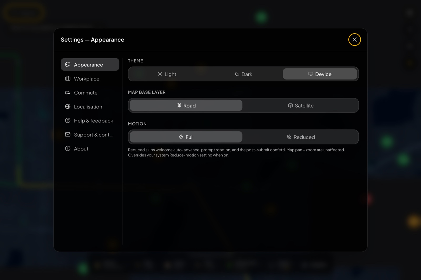
Appearance covers the look of the map:
- Theme: Light, Dark, or Device (follow your system setting). The default leans dark because the hexagons and dock contrast better against a dark basemap, but the light theme reads well in daylight.
- Map base layer: Road or Satellite. Satellite is handy when a listing photo doesn’t match the building outline you remember from a visit, or when you want to see the actual greenery and water bodies nearby.
- Motion: Full or Reduced. Reduced skips the welcome auto-advance, the rotating prompts, and the post-submit confetti, and it overrides your system reduce-motion setting when on. Map pan and zoom are unaffected.
Switching the theme recolours the whole map live:

Localisation is where know.place adapts to where you are:
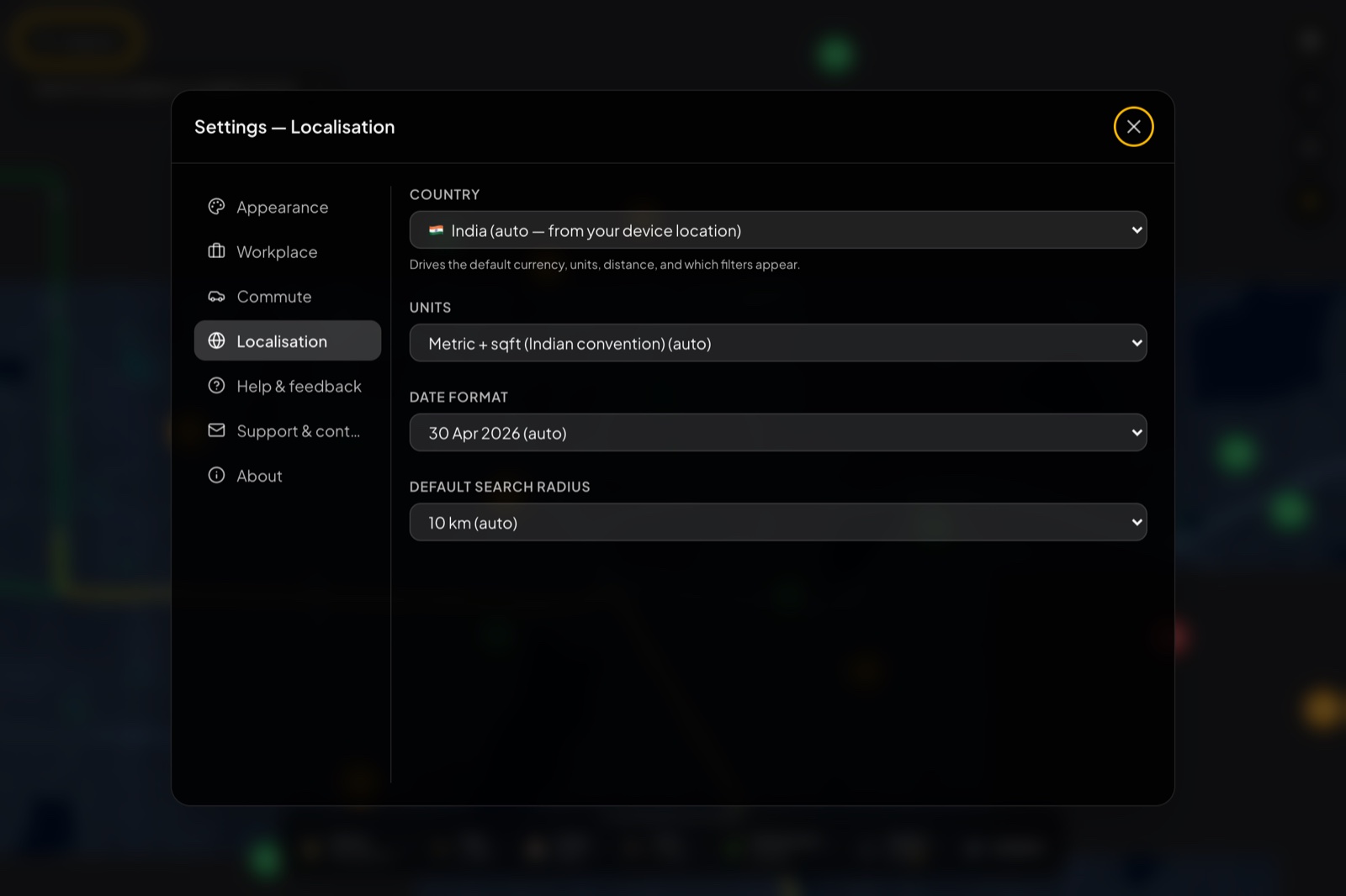
- Country (auto-detected from your device) drives the default currency, units, distance, and which filters appear.
- Units: for India the default is metric plus sqft (the convention people actually use here); you can switch it.
- Date format and Default search radius round it out.
The remaining tabs are self-explanatory: Help & feedback, Support & contact, and About.
Step 9. Add your own experience
This is the part that makes the rest work, and it’s deliberately built to be quick. From any building panel, click Share your experience and sign in with Google (one click, no spam, your email is never shown next to your review).
The form is one short scroll, not a long multi-step wizard. It opens straight on the one thing that matters most:
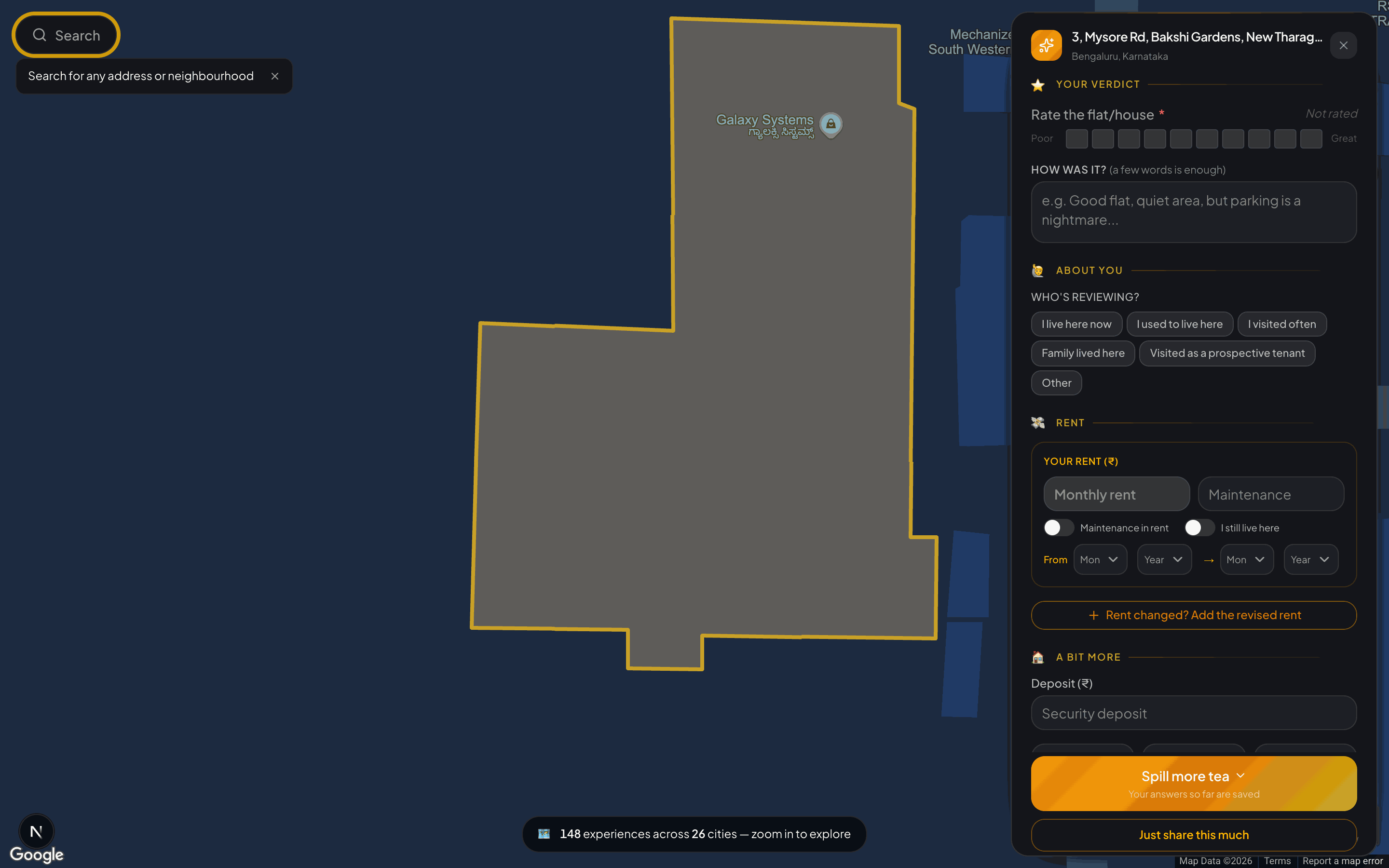
Top to bottom, here’s what it asks, all of it optional except the first rating:
- Your verdict. Rate the flat or house out of 10 (this is the one required field), and optionally drop a one-line “how was it” (the placeholder nudges you: “Good flat, quiet area, but parking is a nightmare…”).
- About you. A single tap on who’s reviewing: living here now, used to live here, visited often, family lived here, or a prospective tenant who looked around.
- Rent. Monthly rent and maintenance, toggles for “maintenance included in rent” and “I still live here”, and the from/to months you lived there. If your rent changed over time, “Rent changed? Add the revised rent” lets you log that too.
- A bit more. Security deposit, and quick dropdowns for type, owned-vs-rented, BHK, and furnishing.
Scroll on and there’s room to say as much or as little as you like: a separate neighbourhood rating, a landlord vibe picker (hands-off and chill, friendly and helpful, nosy and intrusive, difficult to deal with, and so on) with an optional note, and a private email field (never shown publicly).
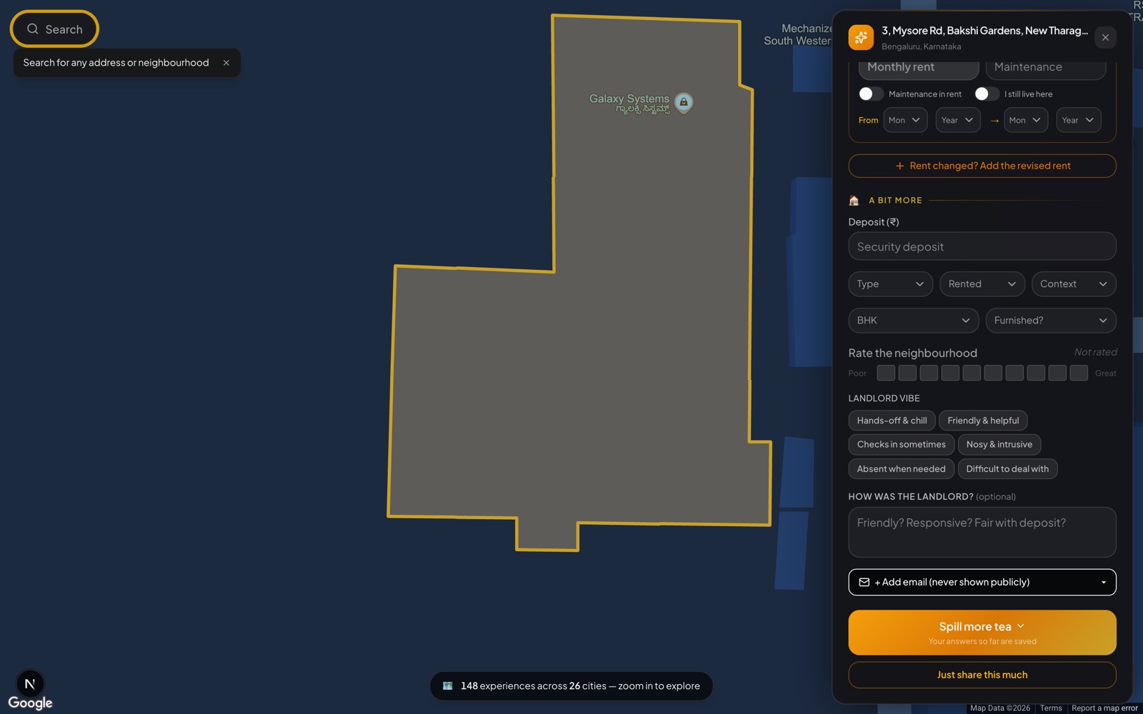
Two buttons sit at the bottom throughout. Just share this much submits whatever you’ve filled in so far, even if that’s only the rating. Spill more tea expands the form for the people who want to write the detailed review they wish they’d found. Your answers are saved as you go, so you can stop at any point.
Only the flat rating is required. Everything else is optional, and even a one-tap rating plus “would I live here again” is genuinely useful to the next person. The more you add, the more useful it gets, but the floor for “worth submitting” is a single tap.
A few practical points:
- Your answers are saved as you fill them, so a half-finished review isn’t lost if you get interrupted.
- You can edit or delete later from your profile (top-right when signed in). We never silently change a review you posted.
- Personal information is stripped. If a name or phone number slips into a free-text field, the moderation pass removes it before publishing.
- It goes live within a few minutes. Submissions pass a light moderation step (mostly automated PII-stripping and spam removal) and then join the public dataset. Your hexagon appears on the map on the next load.
Why bother? Every review you add sharpens the data the next person sees, and it’s one of the few ways to push the Indian rental market toward honest signals. Listings have an incentive to make every building look great; reviews don’t.
Step 10. Stay in the loop
If you want to hear when we ship something new, the Updates tile on the dock opens a small subscribe box. No spam: one email when we ship something new, one when we launch something big, nothing else. It’s optional and entirely separate from reviewing.
Good to know
A few details that help you get the most out of the map:
- Markers appear when you zoom in. The map keeps itself clean by showing building hexagons only at the zoom levels where they’re large enough to tap. Zoomed out, the bottom pill ("N experiences across M cities") tells you the coverage at a glance; zoom in and the buildings come into focus.
- A wide-zoom marker can stand for several buildings. Click one and the map smoothly zooms in so the individual hexagons separate and become clickable.
- The dock waits for enough signal. It appears once there are enough experiences in view to give a meaningful average, so a number you see is always backed by real reviews. Zoom or pan to a busier area and it fills in.
- Your workplace and commute picks live on your device. That keeps them private and sign-in-free; if you switch browsers, just set your workplace again in a few seconds.
- Commute figures are quick estimates for ranking buildings against each other, not minute-accurate trip planning.
- Metro details show up in cities that have a metro. Elsewhere the map simply focuses on the buildings and the dock.
- Search likes a comma between place and city. “Koramangala, Bangalore” (or just “Koramangala”) resolves cleanly.
- On mobile, the right-rail controls tuck into a single menu button. Tap it to expand.
That’s the whole product
The short version, top to bottom: open and skim the welcome tour, search or zoom to your area, scan the dock, drill into a pill, set your workplace and turn on metro lines, then open buildings and read the metro, commute, and review panels, tweaking theme and localisation to taste. Add your own experience when it’s your turn. Everything above is the long version, with the extra detail that takes longer to discover by yourself.
If know.place helped you decide something (or saved you from a bad lease), the most useful thing you can do is add one experience. A few minutes today, sharper data forever, both for you when you move again and for everyone else looking at the building after you.